A candle compresses past trades; it does not predict the next one.
Four observations, one shape
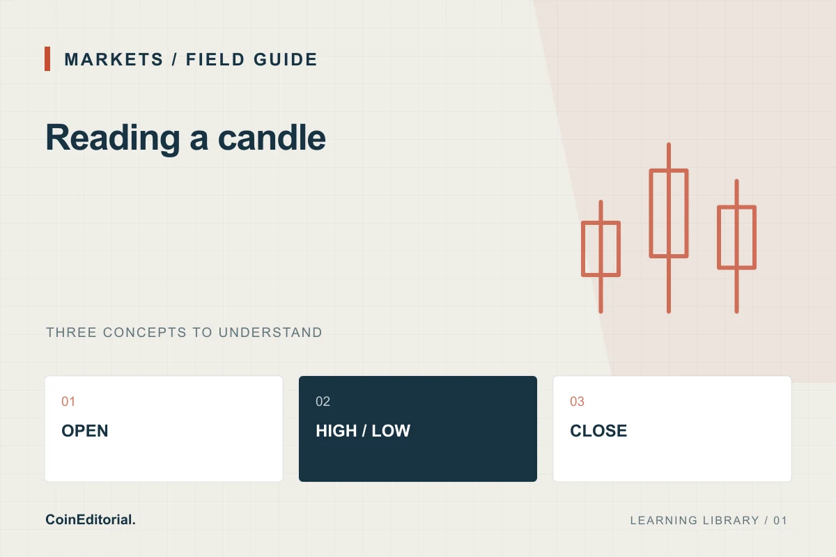
A candlestick summarises trades within a chosen interval. Its body connects the opening and closing prices; its wicks show the extremes. Colour normally distinguishes a higher close from a lower close, but interfaces can use different conventions. Kraken’s market-data documentation also distinguishes a still-forming interval from completed observations. Check the venue, pair, interval and timezone before comparing charts.
A worked example
Imagine a hypothetical hourly candle that opens at $100, trades as high as $108 and as low as $96, then closes at $103. The body spans $100 to $103. The full trading range is $12. The candle alone cannot tell you whether the high happened before the low, how much could have been traded at either extreme, or how many independent people participated.
Why screenshots disagree
A one-minute candle and a daily candle answer different questions. A token priced in SOL can also move differently from the same token priced in dollars when SOL changes value. Comparing a finished candle with a still-open one creates another mismatch. In a notebook, write the pair and observation time beside the chart rather than saving an unexplained green rectangle.
A useful reading exercise
Select one completed interval and describe only what it establishes: first price, last price, observed range and reported volume. Then list what remains unknown, such as available depth or the reason participants traded. Compare the next interval only after it closes. This habit makes chart commentary more precise without turning a visual pattern into a promised trading signal.
Sources & further reading
Sources checked 7 October 2026. Source-linked explanatory content; not personalised investment advice. Found an error? Request a correction.